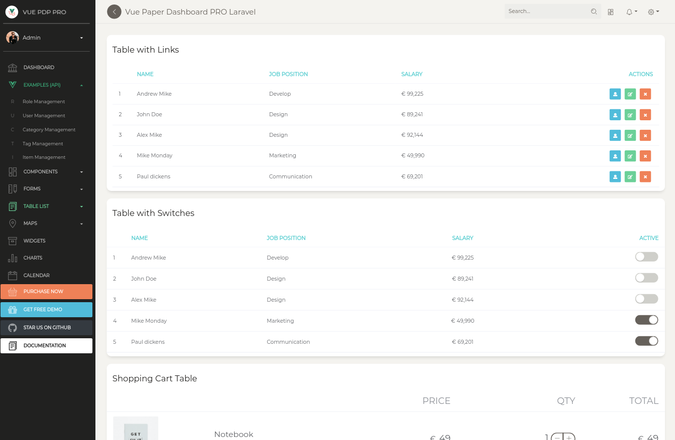
Vue Paper Dashboard Pro Laravel


Frontend version: Paper Dashboard v2.1.1. More info at https://www.creative-tim.com/product/paper-dashboard-2-pro
Vue version: Vue Paper Dashboard v2.3.0. More info at https://www.creative-tim.com/product/vue-paper-dashboard-2-pro

What if you could go from frontend to fullstack in an instant when building your app? We partnered with UPDIVISION to bring you Vue Paper Dashboard PRO, the ultimate fullstack resource. Vue Paper Dashboard PRO comes not only with a huge number of UI components and a Vue Paper frontend, but also with an API-powered Laravel backend.
Download
For the PRO version of the project you will download the .zip file from the Creative Tim site and extract it.
You will get two project folders: one for the Laravel API project and one for the Vue frontend.
Laravel API Setup
Introduction
JSON:API is a specification for how a client should request that resources be fetched or modified, and how a server should respond to those requests. It is designed to minimize both the number of requests and the amount of data transmitted between clients and servers. This efficiency is achieved without compromising readability, flexibility, or discoverability.
Click here to go to the JSON:API docs
Prerequisites
JSON:API backend
The Laravel JSON:API backend project requires a proper multi-threaded web server such as Apache/Nginx environment with PHP, Composer and MySQL.
Do not use php artisan serve as it will result in stalled requests due to the single-threaded nature of the built-in PHP web server.
We strongly recommend using Laradock for Linux and Mac or Laragon for Windows if possible.
Other options for your local environment:
- Windows: How to install WAMP on Windows
- Linux: How to install LAMP on Linux
- Mac: How to install MAMP on MAC
You will also need to install Composer 2: https://getcomposer.org/doc/00-intro.md
Vue Paper frontend
The Vue Paper frontend project requires a working local environment with NodeJS version 8.9 or above (8.11.0+ recommended), npm, VueCLI.
Install Node: https://nodejs.org/ (version 8.11.0+ recommended)
Install NPM: https://www.npmjs.com/get-npm
Install VueCLI: https://cli.vuejs.org/guide/installation.html
Laravel API Project Installation
- Navigate in your Laravel API project folder:
cd your-laravel-json-api-project - Install project dependencies:
composer install - Create a new .env file:
cp .env.example .env - Add your own database credentials in the .env file in DB_DATABASE, DB_USERNAME, DB_PASSWORD
- Create users table:
php artisan migrate --seed - Generate application key:
php artisan key:generate - Install Laravel Passport:
php artisan passport:installand set in the .env file the CLIENT_ID and CLIENT_SECRET that you receive - Add your own mailtrap.io credentials in MAIL_USERNAME and MAIL_PASSWORD in the .env file
Vue Paper Dashboard Project Installation
- Navigate to your Vue Paper Dashboard project folder:
cd your-vue-paper-dashbord-project - Install project dependencies:
npm install - Create a new .env file:
cp .env.example .env VUE_APP_BASE_URLshould contain the URL of your Vue Paper Dashboard Project (eg. http://localhost:8080/)VUE_APP_API_BASE_URLshould contain the URL of your Laravel JSON:API Project. (eg. http://localhost:3000/api/v1)- Run
npm run devto start the application in a local development environment ornpm run buildto build release distributables.
Usage
To start testing the Pro theme, register as a user or log in using one of the default users:
- admin type - [email protected] with the password secret
- creator type - [email protected] with the password secret
- member type - [email protected] with the password secret
In addition to the features included in the free theme, the Pro theme also has a role management example with an updated user management, as well as tag management, category management and item management examples. All the necessary files are installed out of the box and all the needed routes are added to src\router\routes.js. Keep in mind that all the features can be viewed once you log in using the credentials provided above or by registering your own user.
Each role has a different privilege level and can perform a certain number of actions according to this level.
A member type user can log in, update his profile and view a list of added items. A creator type user can log in, update his profile and perform actions on categories, tags and items. A admin type user can log in, update his profile and perform actions on categories, tags, items, roles and users.
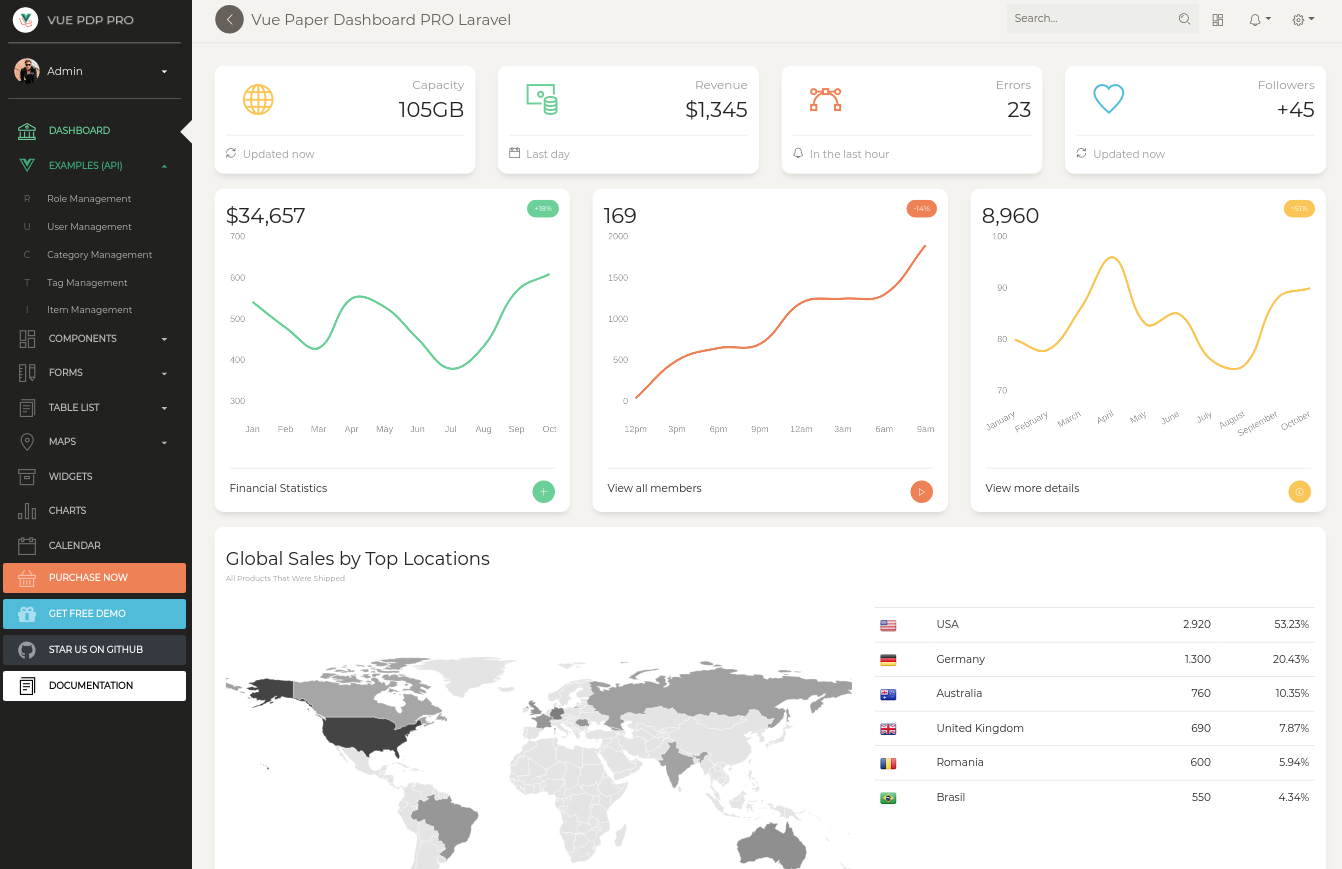
Dashboard
You can access the dashboard either by using the "Dashboards/Dashboard" link in the left sidebar or by adding /dashboard in the URL.
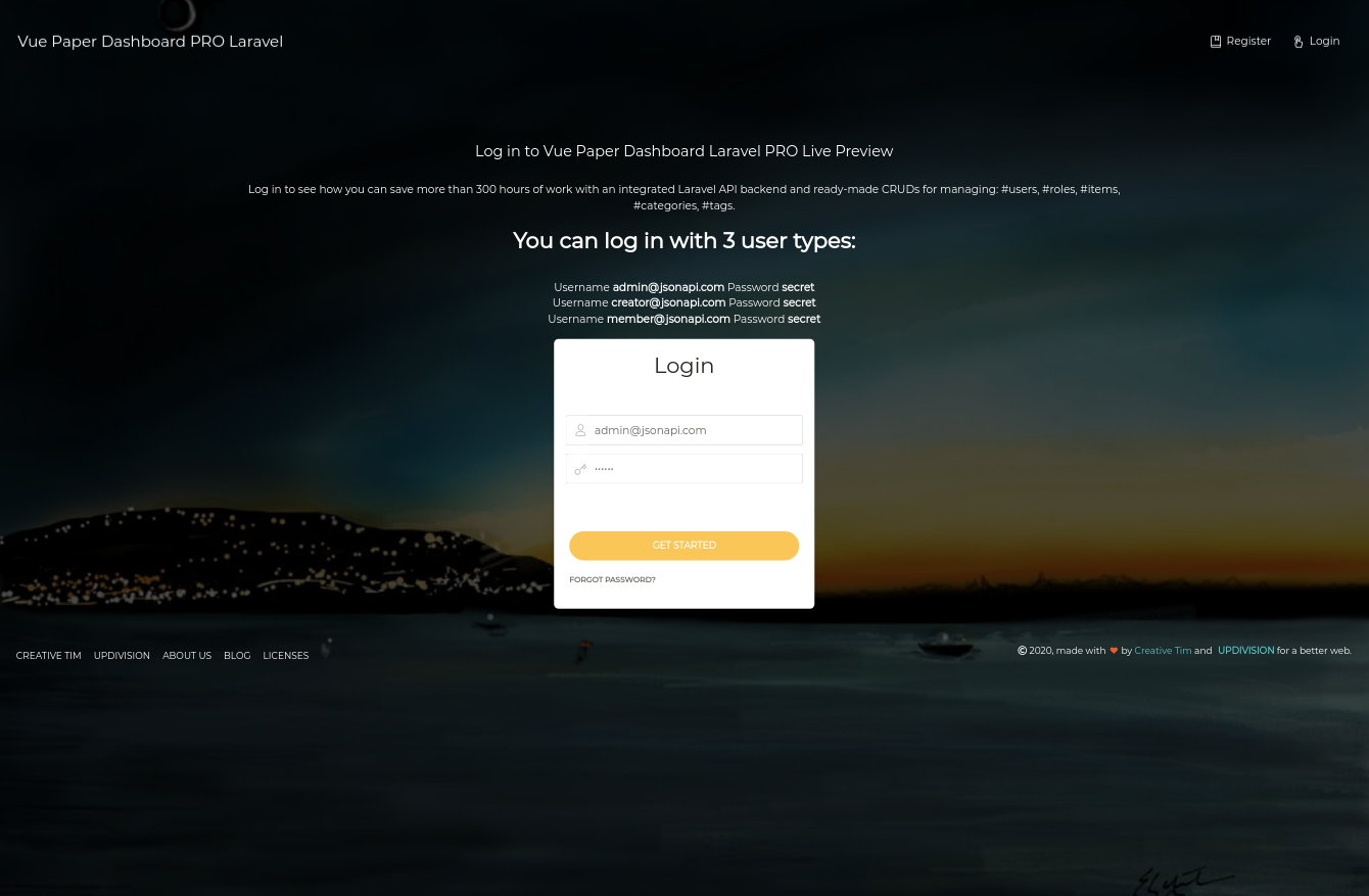
Login
The login functionality is fully implemented in our theme helping you to start your project in no time. To login into dashboard you just have to add /login in the URL and fill the login form with one of the credentials (user: [email protected], [email protected], [email protected] and password: secret).
The src\components\Dashboard\Views\Pages\Login.vue is the Vue component which handles the login functinality. You can easily adapt it to your needs.
It uses the auth store located in src\store\modules\auth.js.
Login Card
<div class="container">
  <div class="header-body text-center" style="margin-bottom: 15px;">
        <div class="row justify-content-center">
          <div class="text-center">
            <h1 class="text-white">Log in to Vue Paper Dashboard Laravel PRO Live Preview</h1>
            <p class="text-lead text-white">Log in to see how you can save more than 300 hours of work with an
            integrated Laravel API backend and ready-made CRUDs for managing:
            #users, #roles, #items, #categories, #tags.</p>
          </div>

          <div class="text-white">
            <h3 class="text-white"><strong>You can log in with 3 user types:</strong></h3>
            <div>Username <b>[email protected]</b> Password <b>secret</b></div>
            <div>Username <b>[email protected]</b> Password <b>secret</b></div>
            <div>Username <b>[email protected]</b> Password <b>secret</b></div>
          </div>
        </div>
  </div>
  <div class="col-lg-4 col-md-6 ml-auto mr-auto">
    <form @submit.prevent="login">
      <card type="login">
        <h3 slot="header" class="header text-center">Login</h3>

        <fg-input v-model="email" addon-left-icon="nc-icon nc-single-02" placeholder="Email"/>
        <validation-error :errors="apiValidationErrors.email" />
        <fg-input v-model="password" addon-left-icon="nc-icon nc-key-25" placeholder="Password" type="password"/>
        <validation-error :errors="apiValidationErrors.password" />
        <br>

        <p-button native-type="submit" slot="footer" type="warning" round block class="mb-3">Get started</p-button>
      </card>
    </form>
  </div>
</div>
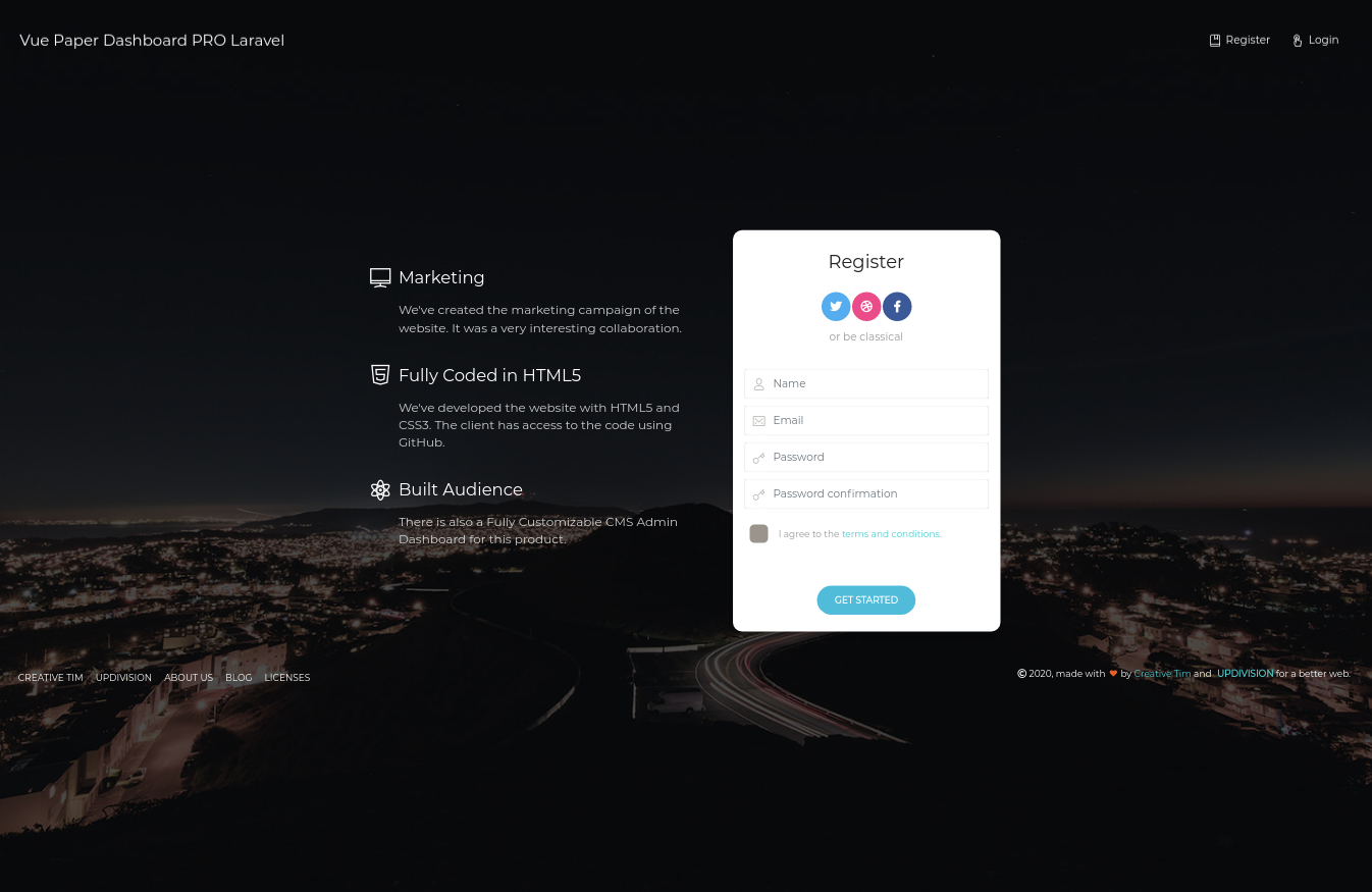
Register
The register functionality is fully implemented in our theme helping you to start your project in no time. To register a new user you just have to add /register in the URL or click on register link from login page and fill the register form with user details.
The src\components\Dashboard\Views\Pages\Register.vue is the Vue component which handles the login functinality. You can easily extend it to your needs.
It uses the auth store located in src\store\modules\auth.js.
Register card
<form @submit.prevent="register">
  <card type="signup" class="text-center">
    <template slot="header">
      <h4 class="card-title">Register</h4>
      <div class="social">
        <button class="btn btn-icon btn-round btn-twitter">
          <i class="fa fa-twitter"></i>
        </button>
        <button class="btn btn-icon btn-round btn-dribbble">
          <i class="fa fa-dribbble"></i>
        </button>
        <button class="btn btn-icon btn-round btn-facebook">
          <i class="fa fa-facebook-f"></i>
        </button>
        <p class="card-description"> or be classical </p>
      </div>
    </template>

    <fg-input v-model="name" addon-left-icon="nc-icon nc-single-02" placeholder="Name"/>
    <validation-error :errors="apiValidationErrors.name"/>
    <fg-input v-model="email" addon-left-icon="nc-icon nc-email-85" placeholder="Email"/>
    <validation-error :errors="apiValidationErrors.email"/>
    <fg-input v-model="password" addon-left-icon="nc-icon nc-key-25" placeholder="Password" type="password"/>
    <validation-error :errors="apiValidationErrors.password"/>
    <fg-input v-model="password_confirmation" addon-left-icon="nc-icon nc-key-25" placeholder="Password confirmation" type="password"/>
    <validation-error :errors="apiValidationErrors.password_confirmation"/>
    <p-checkbox class="text-left" v-model="boolean">
      I agree to the
      <a href="#something">terms and conditions</a>.
    </p-checkbox>

    <p-button native-type="submit" slot="footer" type="info" round>Get Started</p-button>
  </card>
</form>
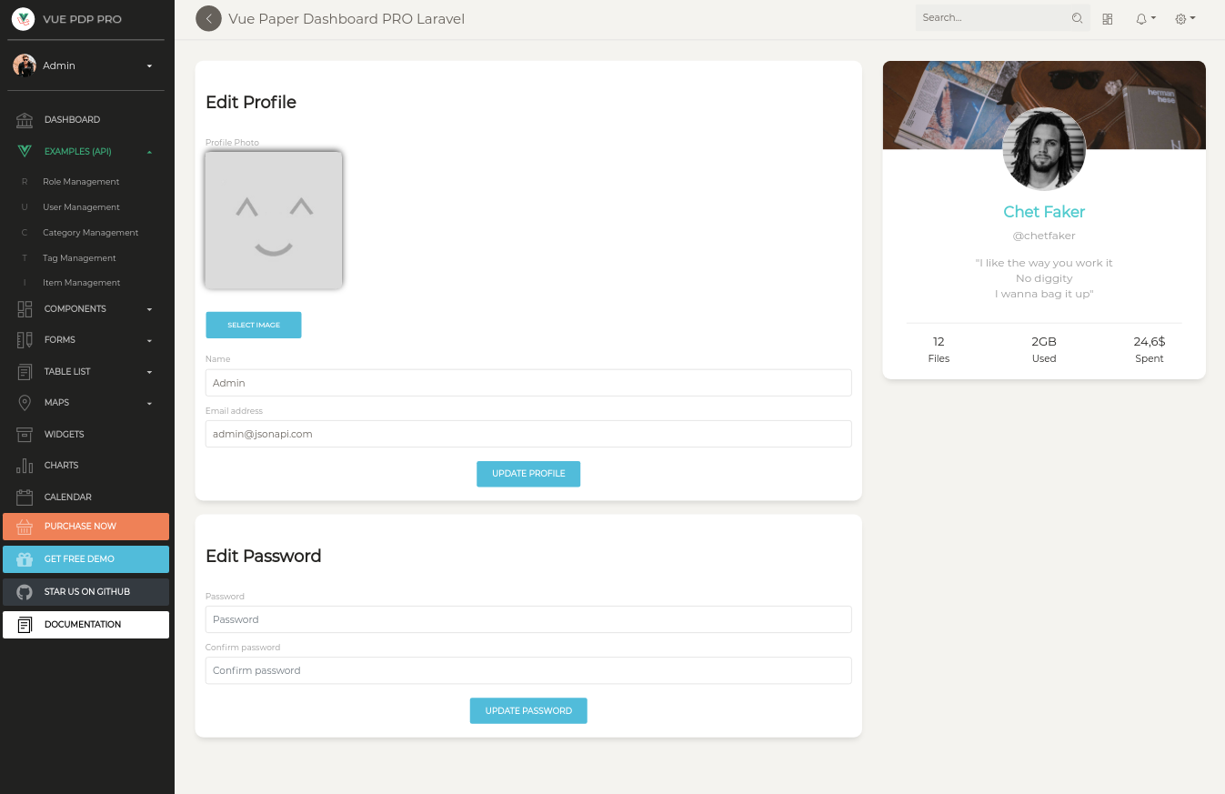
Profile edit
You have the option to edit the current logged in user's profile information (name, email, profile picture) and password. To access this page, just click the "Examples/Profile" link in the left sidebar or add /examples/user-profile in the URL.
The src\components\Dashboard\Views\Examples\UserProfile is the folder with Vue components that handle the update of the user information and password.
Edit profile component
<template>
  <div class="card">
    <div class="card-header">
      <h4 class="title">Edit Profile</h4>
    </div>
    <div class="card-body">
      <form ref="profile_form" @submit.prevent="updateProfile">
         <div class="form-group">
          <label class="form-control-label"> Profile Photo </label>
          <div
            v-if="image"
            class="profile-image card-img pb-4"
            :style="{
              'background-image': `url('${image}')`,
            }"
          ></div>
          <div v-else class="profile-image">
            <img src="/img/placeholder.jpg" />
          </div>
          <div class="image-upload">
            <button
              v-if="image"
              type="button"
              class="btn btn-fill btn-wd btn-danger"
              @click="removeImage"
            >
              <span>
                <i class="fa fa-times" />
                Remove
              </span>
            </button>
            <button type="button" class="btn btn-info btn-fill btn-wd">
              <label v-if="!image" for="imageInput" class="mb-0">Select image</label>
              <label v-else for="imageInput" class="mb-0">Change</label>
              <input
                id="imageInput"
                ref="imageInput"
                accept="image/*"
                type="file"
                style="display: none"
                @input="onSelectFile"
              />
            </button>
          </div>
        </div>
        <validation-error :errors="apiValidationErrors.attachment" />
        <fg-input v-model="user.name" placeholder="Name" label="Name"></fg-input>
        <validation-error :errors="apiValidationErrors.name" />
        <fg-input v-model="user.email" placeholder="Enter email" label="Email address"></fg-input>
        <validation-error :errors="apiValidationErrors.email" />
        <div class="text-center">
          <button native-type="submit" class="btn btn-info btn-fill btn-wd" @click.prevent="updateProfile">
            Update Profile
          </button>
        </div>
        <div class="clearfix"></div>
      </form>
    </div>
  </div>
</template>
<script>
import formMixin from "@/mixins/form-mixin";
import ValidationError from "src/components/UIComponents/ValidationError.vue";
  export default {
    mixins: [formMixin],
    components: {
      ValidationError
    },
    props: {
      user: Object
    },

    data() {
      return {
        image: null,
      };
    },
    methods: {
      async onSelectFile(e) {
        const input = this.$refs.imageInput;
        const files = input.files;

        if (files && files[0]) {
          const reader = new FileReader();
          reader.onload = (e) => {
            this.image = e.target.result;
          };
          reader.readAsDataURL(files[0]);
        }
      },
      removeImage() {
        this.image = null;
      },
      async updateProfile () {
         try {
          if (this.image) {
            await this.$store.dispatch("users/upload", {user: this.user, image: this.$refs.imageInput.files[0]})
            this.user.profile_image = await this.$store.getters["users/url"]
          }

          await this.$store.dispatch("profile/update", this.user)
          this.removeImage();
          this.resetApiValidation();
          this.$notify({
            type: 'success',
            message: 'Profile updated successfully.',
            icon: 'nc-icon nc-bell-55',
          })
          await this.$store.getters["profile/me"]
        } catch (e) {
          this.$notify({
            type: 'danger',
            message: 'Oops, something went wrong!',
            icon: 'nc-icon nc-bell-55',
          })
          this.setApiValidation(e.response.data.errors)
        }
      }
    }
  }
</script>
Edit password component
<template>
  <div class="card">
    <div class="card-header">
      <h4 class="title">Edit Password</h4>
    </div>
    <div class="card-body">
      <form ref="password_form" @submit.prevent="changePassword">
        <fg-input v-model="password" placeholder="Password" label="Password" type="password"></fg-input>
        <validation-error :errors="apiValidationErrors.password" />
        <fg-input v-model="password_confirmation" placeholder="Confirm password" label="Confirm password" type="password"></fg-input>
        <validation-error :errors="apiValidationErrors.password_confirmation" />
        <div class="text-center">
          <button native-type="submit" class="btn btn-info btn-fill btn-wd" @click.prevent="changePassword">
            Update Password
          </button>
        </div>
        <div class="clearfix"></div>
      </form>
    </div>
  </div>
</template>
<script>
import formMixin from "@/mixins/form-mixin";
import ValidationError from "src/components/UIComponents/ValidationError.vue";
  export default {
    mixins: [formMixin],
    components: {
      ValidationError
    },
    props: {
      user: Object
    },

    data: () => ({
      password: null,
      password_confirmation: null,
    }),
    methods: {
      async changePassword () {

        const user = {
          id: this.user.id,
          type: "users",
          password: this.password,
          password_confirmation: this.password_confirmation
        }
         try {
          this.resetApiValidation();
          await this.$store.dispatch("users/update", user)
          this.user = await this.$store.getters["profile/me"];
          this.$refs["password_form"].reset();

          this.$notify({
            type: 'success',
            message: 'Profile updated successfully.',
            icon: 'nc-icon nc-bell-55',
          })
        } catch (e) {
          this.$notify({
            type: 'danger',
            message: 'Oops, something went wrong!',
            icon: 'nc-icon nc-bell-55',
          })
          this.setApiValidation(e.response.data.errors)
        }
      }
    }
  }
</script>
Role management
The Pro theme allows you to add user roles. By default, the theme comes with Admin, Creator and Member roles. To access the role management example click the "Examples/Role Management" link in the left sidebar or add /examples/role-management/list-roles to the URL. Here you can add/edit new roles. To add a new role, click the "Add role" button. To edit an existing role, click the dotted menu (available on every table row) and then click "Edit". In both cases, you will be directed to a form which allows you to modify the name and description of a role.
The store used for role functionality is found in src\store\modules\roles-module.vue
You can find the compoments for role functionality in src\components\Dashboard\Views\Examples\RoleManagement folder.
List page
<div class="card-body row">
  <div class="col-sm-6">
    <el-select
      class="select-default"
      v-model="pagination.perPage"
      placeholder="Per page">
      <el-option
        class="select-default"
        v-for="item in pagination.perPageOptions"
        :key="item"
        :label="item"
        :value="item">
      </el-option>
    </el-select>
  </div>
  <div class="col-sm-6">
    <div class="pull-right">
      <fg-input class="input-sm"
        placeholder="Search"
        v-model="query"
        addon-right-icon="nc-icon nc-zoom-split">
      </fg-input>
    </div>
  </div>
  <div class="col-sm-12 mt-2">
    <el-table class="table-striped" :data="table" border @sort-change="sortChange">
      <el-table-column label="Name" prop="name" sortable="custom" />
      <el-table-column label="Created At" prop="created_at" sortable="custom"/>
      <el-table-column fixed="right" class-name="td-actions" label="Actions">
        <template slot-scope="props">
          <p-button type="success" size="sm" icon @click="goToEdit(props.row.id)">
            <i class="fa fa-edit"></i>
          </p-button>
          <p-button type="danger" size="sm" icon @click="destroy(props.row.id)">
            <i class="fa fa-times"></i>
          </p-button>
        </template>
      </el-table-column>
    </el-table>
  </div>
  <div class="col-sm-6 pagination-info">
    <p class="category">Showing {{from + 1}} to {{to}} of {{total}} entries</p>
  </div>
  <div class="col-sm-6">
    <p-pagination class="pull-right"
        v-model="pagination.currentPage"
        :per-page="pagination.perPage"
        :total="total">
    </p-pagination>
  </div>
</div>
Add/edit role
<form @submit.prevent>
  <fg-input v-model="role.name" placeholder="Name" label="Name" ></fg-input>
  <validation-error :errors="apiValidationErrors.name" />
  <div class="text-center">
    <button native-type="submit" class="btn btn-info btn-fill btn-wd">
      Submit
    </button>
  </div>
  <div class="clearfix"></div>
</form>
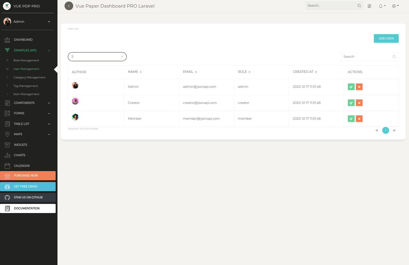
User management
The theme comes with an out of the box user management option. To access this option ,click the "Examples/User Management" link in the left sidebar or add /examples/user-management/list-users to the URL. The first thing you will see is a list of existing users. You can add new ones by clicking the "Add user" button (above the table on the right). On the Add user page, you will find a form which allows you to fill out the user`s name, email, role and password.
The store used for role functionality is found in src\store\modules\users-module.vue
You can find the compoments for role functionality in src\components\Dashboard\Views\Examples\UserManagement folder.
Once you add more users, the list will grow and for every user you will have edit and delete options (access these options by clicking the three dotted menu that appears at the end of every row).
<div class="card-body row">
  <div class="col-sm-6">
    <el-select
      class="select-default"
      v-model="pagination.perPage"
      placeholder="Per page">
      <el-option
        class="select-default"
        v-for="item in pagination.perPageOptions"
        :key="item"
        :label="item"
        :value="item">
      </el-option>
    </el-select>
  </div>
  <div class="col-sm-6">
    <div class="pull-right">
      <fg-input class="input-sm"
        placeholder="Search"
        v-model="query"
        addon-right-icon="nc-icon nc-zoom-split">
      </fg-input>
    </div>
  </div>
  <div class="col-sm-12 mt-2">
    <el-table class="table-striped" :data="table" border @sort-change="sortChange">
      <el-table-column label="Author">
          <template v-slot="{ row }">
              <img v-if="row.profile_image" :src="row.profile_image" class="avatar rounded-circle"/>
          </template>
      </el-table-column>
      <el-table-column label="Name" prop="name" sortable="custom" />
      <el-table-column label="Email" prop="email" sortable="custom" />
      <el-table-column label="Role" prop="roles.name" sortable="custom">
        <template v-slot="{ row }">
          <span>{{ row.roles[0].name }}</span>
        </template>
      </el-table-column>
      <el-table-column label="Created At" prop="created_at" sortable="custom"/>
      <el-table-column fixed="right" class-name="td-actions" label="Actions">
        <template slot-scope="props">
          <p-button type="success" size="sm" icon @click="goToEdit(props.row.id)">
            <i class="fa fa-edit"></i>
          </p-button>
          <p-button type="danger" size="sm" icon @click="destroy(props.row.id)">
            <i class="fa fa-times"></i>
          </p-button>
        </template>
      </el-table-column>
    </el-table>
  </div>
  <div class="col-sm-6 pagination-info">
    <p class="category">Showing {{from + 1}} to {{to}} of {{total}} entries</p>
  </div>
  <div class="col-sm-6">
    <p-pagination class="pull-right"
      v-model="pagination.currentPage"
      :per-page="pagination.perPage"
      :total="total">
    </p-pagination>
  </div>
</div>
Tag management
Out of the box you will have an example of tag management (for the cases in which you are developing a blog or a shop). To access this example, click the "Examples/Tag Management" link in the left sidebar or add /examples/tag-management/list-tags to the URL. You can add and edit tags here, but you can only delete them if they are not attached to any items.
The store used for role functionality is found in src\store\modules\tags-module.vue
You can find the compoments for role functionality in src\components\Dashboard\Views\Examples\TagManagement folder.
<div class="card-body row">
  <div class="col-sm-6">
    <el-select
      class="select-default"
      v-model="pagination.perPage"
      placeholder="Per page">
      <el-option
        class="select-default"
        v-for="item in pagination.perPageOptions"
        :key="item"
        :label="item"
        :value="item">
      </el-option>
    </el-select>
  </div>
  <div class="col-sm-6">
    <div class="pull-right">
      <fg-input class="input-sm"
        placeholder="Search"
        v-model="query"
        addon-right-icon="nc-icon nc-zoom-split">
      </fg-input>
    </div>
  </div>
  <div class="col-sm-12 mt-2">
    <el-table class="table-striped" :data="tags" border @sort-change="sortChange">
      <el-table-column label="Name" prop="name" sortable="custom" />
      <el-table-column label="Color" prop="color" sortable="custom">
        <template slot-scope="{ row }">
          <span
            class="badge badge-default"
            :style="{ backgroundColor: row.color }"
            >{{ row.name }}</span
          >
        </template>
      </el-table-column>
      <el-table-column label="Created At" prop="created_at" sortable="custom"/>
      <el-table-column fixed="right" class-name="td-actions" label="Actions">
        <template slot-scope="props">
          <p-button type="success" size="sm" icon @click="goToEdit(props.row.id)">
            <i class="fa fa-edit"></i>
          </p-button>
          <p-button type="danger" size="sm" icon @click="deleteTag(props.row.id)">
            <i class="fa fa-times"></i>
          </p-button>
        </template>
      </el-table-column>
    </el-table>
  </div>
  <div class="col-sm-6 pagination-info">
    <p class="category">Showing {{from + 1}} to {{to}} of {{total}} entries</p>
  </div>
  <div class="col-sm-6">
    <p-pagination class="pull-right"
      v-model="pagination.currentPage"
      :per-page="pagination.perPage"
      :total="total">
    </p-pagination>
  </div>
</div>
Category management
Out of the box you will have an example of category management (for the cases in which you are developing a blog or a shop). To access this example, click the "Examples/Category Management" link in the left sidebar or add /examples/category-management/list-categories to the URL. You can add and edit categories here, but you can only delete them if they are not attached to any items.
The store used for category functionality is found in src\store\modules\categories-module.vue
You can find the compoments for category functionality in src\components\Dashboard\Views\Examples\CategoryManagement folder.
<div class="card-body row">
  <div class="col-sm-6">
    <el-select
      class="select-default"
      v-model="pagination.perPage"
      placeholder="Per page">
      <el-option
        class="select-default"
        v-for="item in pagination.perPageOptions"
        :key="item"
        :label="item"
        :value="item">
      </el-option>
    </el-select>
  </div>
  <div class="col-sm-6">
    <div class="pull-right">
      <fg-input class="input-sm"
        placeholder="Search"
        v-model="query"
        addon-right-icon="nc-icon nc-zoom-split">
      </fg-input>
    </div>
  </div>
  <div class="col-sm-12 mt-2">
    <el-table class="table-striped" :data="categories" border @sort-change="sortChange">
      <el-table-column label="Name" prop="name" sortable="custom" />
      <el-table-column label="Description" prop="description" sortable="custom" />
      <el-table-column label="Created At" prop="created_at" sortable="custom"/>
      <el-table-column fixed="right" class-name="td-actions" label="Actions">
        <template slot-scope="props">
          <p-button type="success" size="sm" icon @click="goToEdit(props.row.id)">
            <i class="fa fa-edit"></i>
          </p-button>
          <p-button type="danger" size="sm" icon @click="deleteCategory(props.row.id)">
            <i class="fa fa-times"></i>
          </p-button>
        </template>
      </el-table-column>
    </el-table>
  </div>
  <div class="col-sm-6 pagination-info">
    <p class="category">Showing {{from + 1}} to {{to}} of {{total}} entries</p>
  </div>
  <div class="col-sm-6">
    <p-pagination class="pull-right"
      v-model="pagination.currentPage"
      :per-page="pagination.perPage"
      :total="total">
    </p-pagination>
  </div>
</div>
Item management
Item management is the most advanced example included in the Pro theme, because every item has a picture, belongs to a category and has multiple tags. To access this example click the "Examples/Item Management" link in the left sidebar or add /examples/item-management/list-items to the URL. Here you can manage the items. A list of items will appear once you start adding them (to access the add page click "Add item"). On the add page, besides the Name and Description fields (which are present in most of the CRUD examples) you can see a category dropdown, which contains the categories you added, a file input and a tag multi select. If you did not add any categories or tags, please go to the corresponding sections (category management, tag management) and add some.
The store used for roles functionality is found in src\store\modules\items-module.vue
You can find the compoments for items functionality in src\components\Dashboard\Views\Examples\ItemManagement folder.
List Items
<div class="card-body row">
  <div class="col-sm-6">
    <el-select
      class="select-default"
      v-model="pagination.perPage"
      placeholder="Per page">
      <el-option
        class="select-default"
        v-for="item in pagination.perPageOptions"
        :key="item"
        :label="item"
        :value="item">
      </el-option>
    </el-select>
  </div>
  <div class="col-sm-6">
    <div class="pull-right">
      <fg-input class="input-sm"
        placeholder="Search"
        v-model="query"
        addon-right-icon="nc-icon nc-zoom-split">
      </fg-input>
    </div>
  </div>
  <div class="col-sm-12 mt-2">
    <el-table class="table-striped" :data="items" border @sort-change="sortChange">
      <el-table-column label="Name" prop="name" sortable="custom" />
      <el-table-column label="Category" prop="category.name" sortable="custom" />
      <el-table-column label="Picture" min-width="150px">
        <template v-slot="{ row }">
          <img v-if="row.image"
            :src="row.image"
            style="width: 100px; height: auto"
            alt="avatar"
          />
        </template>
      </el-table-column>
      <el-table-column label="Tags" prop="tags.name" sortable="custom">
        <template slot-scope="{ row }">
          <span
            v-for="(tag, index) in row.tags"
            :key="'tag' + index"
            class="badge badge-default"
            :style="{ backgroundColor: tag.color, margin: '.1rem' }"
            >{{ tag.name }}</span
          >
        </template>
      </el-table-column>
      <el-table-column label="Created At" prop="created_at" sortable="custom"/>
      <el-table-column
        fixed="right"
        class-name="td-actions"
        label="Actions">
        <template slot-scope="props">
          <p-button type="success" size="sm" icon @click="goToEdit(props.row.id)">
            <i class="fa fa-edit"></i>
          </p-button>
          <p-button type="danger" size="sm" icon @click="deleteItem(props.row.id)">
            <i class="fa fa-times"></i>
          </p-button>
        </template>
      </el-table-column>
    </el-table>
  </div>
  <div class="col-sm-6 pagination-info">
    <p class="category">Showing {{from + 1}} to {{to}} of {{total}} entries</p>
  </div>
  <div class="col-sm-6">
    <p-pagination class="pull-right"
      v-model="pagination.currentPage"
      :per-page="pagination.perPage"
      :total="total">
    </p-pagination>
  </div>
</div>
Add/Edit Item
<form @submit.prevent>
  <div class="form-group">
    <label class="form-control-label"> Picture </label>
    <div
      v-if="image"
      class="profile-image card-img pb-4"
      :style="{
        'background-image': `url('${image}')`,
      }"
    ></div>
    <div v-else class="profile-image">
      <img src="/img/placeholder.jpg" />
    </div>
    <div class="image-upload">
      <button
        v-if="image"
        type="button"
        class="btn btn-fill btn-wd btn-danger"
        @click="removeImage"
      >
        <span>
          <i class="fa fa-times" />
          Remove
        </span>
      </button>
      <button type="button" class="btn btn-info btn-fill btn-wd">
        <label v-if="!image" for="imageInput" class="mb-0"
          >Select image</label
        >
        <label v-else for="imageInput" class="mb-0">Change</label>
        <input
          id="imageInput"
          ref="imageInput"
          accept="image/*"
          type="file"
          style="display: none"
          @input="onSelectFile"
        />
      </button>
    </div>
  </div>
  <validation-error :errors="apiValidationErrors.attachment" />
  <fg-input v-model="item.name" placeholder="Name" label="Name" ></fg-input>
  <validation-error :errors="apiValidationErrors.name" />
  <fg-input label="Description">
    <ckeditor :editor="editor" v-model="item.description" :config="editorConfig"></ckeditor>
  </fg-input>
  <fg-input label="Category">
    <el-select
      class="select-default" placeholder="Category" v-model="item.category.id">
      <el-option
        class="select-default"
        v-for="category in available_categories"
        :key="category.id"
        :label="category.name"
        :value="category.id">
      </el-option>
    </el-select>
    </fg-input>
    <fg-input label="Tags">
    <el-select
      multiple class="select-default" placeholder="Tags" v-model="tags">
      <el-option
        class="select-default"
        v-for="tag in available_tags"
        :key="tag.id"
        :label="tag.name"
        :value="tag.id">
      </el-option>
    </el-select>
    </fg-input>
    <fg-input label="Status">
      <p-radio v-model="item.status" label="published" class="mb-3">
        Published
      </p-radio>
      <p-radio v-model="item.status" label="draft" class="mb-3">
        Draft
      </p-radio>
      <p-radio v-model="item.status" label="archive" class="mb-3">
        Archive
      </p-radio>
    </fg-input>
    <fg-input label="Show on homepage?">
      <p-switch v-model="item.is_on_homepage"></p-switch>
    </fg-input>
    <fg-input>
    <el-date-picker v-model="item.date_at" type="date" placeholder="Select date and time">
    </el-date-picker>
    </fg-input>
  <div class="text-center">
    <button native-type="submit" class="btn btn-info btn-fill btn-wd">
      Submit
    </button>
  </div>
  <div class="clearfix"></div>
</form>
Table of Contents
- Versions
- Demo
- Documentation
- File Structure
- Browser Support
- Resources
- Reporting Issues
- Licensing
- Useful Links
Versions


| HTML | LARAVEL |
|---|---|
 |  |
| VUE | LARAVEL & VUE |
|---|---|
 | |
Demo
| Register | Login | Dashboard |
|---|---|---|
 |  |  |
| Profile Page | Users Page | Tables Page |
|---|---|---|
 |  |  |
Documentation
The documentation for the Vue Paper Dashboard PRO Laravel is hosted at our website.
File Structure
Within the download you'll find the following directories and files:
├───vue-paper-dashboard
│   App.vue
│   main.js
│   polyfills.js
│
├───assets
│   ├───css
│   │   │   style.css
│   │   │
│   │   └───nucleo
│   └───sass
│       │
│       ├───core
│       └───custom
├───axios
│       index.js
│
├───components
|    ├── Dashboard
|    │   ├── Layout
|    │   │   ├── ContentFooter.vue
|    │   │   ├── Content.vue
|    │   │   ├── DashboardLayout.vue
|    │   │   ├── LoadingMainPanel.vue
|    │   │   └── TopNavbar.vue
|    │   └── Views
|    │       ├── Calendar
|    │       │   ├── CalendarRoute.vue
|    │       │   └── Calendar.vue
|    │       ├── Charts.vue
|    │       ├── Components
|    │       │   ├── Buttons.vue
|    │       │   ├── GridSystem.vue
|    │       │   ├── Icons.vue
|    │       │   ├── Notifications.vue
|    │       │   ├── NotificationTemplate.vue
|    │       │   ├── Panels.vue
|    │       │   ├── SweetAlert.vue
|    │       │   └── Typography.vue
|    │       ├── Dashboard
|    │       │   ├── Overview.vue
|    │       │   ├── Widgets
|    │       │   │   ├── TaskList.vue
|    │       │   │   └── Task.vue
|    │       │   └── Widgets.vue
|    │       ├── Examples
|    │       │   ├── CategoryManagement
|    │       │   │   ├── AddCategoryPage.vue
|    │       │   │   ├── EditCategoryPage.vue
|    │       │   │   └── ListCategoryPage.vue
|    │       │   ├── ItemManagement
|    │       │   │   ├── AddItemPage.vue
|    │       │   │   ├── EditItemPage.vue
|    │       │   │   └── ListItemPage.vue
|    │       │   ├── RoleManagement
|    │       │   │   ├── AddRolePage.vue
|    │       │   │   ├── EditRolePage.vue
|    │       │   │   └── ListRolePage.vue
|    │       │   ├── TagManagement
|    │       │   │   ├── AddTagPage.vue
|    │       │   │   ├── EditTagPage.vue
|    │       │   │   └── ListTagPage.vue
|    │       │   ├── UserManagement
|    │       │   │   ├── AddUserPage.vue
|    │       │   │   ├── EditUserPage.vue
|    │       │   │   └── ListUserPage.vue
|    │       │   ├── UserProfile
|    │       │   │   ├── EditPasswordCard.vue
|    │       │   │   └── EditProfileCard.vue
|    │       │   └── UserProfile.vue
|    │       ├── Forms
|    │       │   ├── ExtendedForms.vue
|    │       │   ├── RegularForms.vue
|    │       │   ├── ValidationForms
|    │       │   │   ├── LoginForm.vue
|    │       │   │   ├── RegisterForm.vue
|    │       │   │   └── TypeValidationForm.vue
|    │       │   ├── ValidationForms.vue
|    │       │   ├── Wizard
|    │       │   │   ├── FirstStep.vue
|    │       │   │   ├── SecondStep.vue
|    │       │   │   └── ThirdStep.vue
|    │       │   └── Wizard.vue
|    │       ├── Maps
|    │       │   ├── API_KEY.js
|    │       │   ├── FullScreenMap.vue
|    │       │   ├── GoogleMaps.vue
|    │       │   ├── VectorMapsPage.vue
|    │       │   ├── VectorMaps.vue
|    │       │   └── WorldMap.vue
|    │       ├── Pages
|    │       │   ├── Layout
|    │       │   │   ├── AppFooter.vue
|    │       │   │   └── AppNavbar.vue
|    │       │   ├── Lock.vue
|    │       │   ├── Login.vue
|    │       │   ├── Register.vue
|    │       │   ├── TimeLinePage.vue
|    │       │   ├── UserProfile
|    │       │   │   ├── EditProfileForm.vue
|    │       │   │   ├── MembersCard.vue
|    │       │   │   └── UserCard.vue
|    │       │   └── UserProfile.vue
|    │       └── Tables
|    │           ├── ExtendedTables.vue
|    │           ├── PaginatedTables.vue
|    │           ├── RegularTables.vue
|    │           └── users.js
|    ├── GeneralViews
|    │   └── NotFoundPage.vue
|    └── UIComponents
|        ├── Badge.vue
|        ├── Button.vue
|        ├── Cards
|        │   ├── Card.vue
|        │   ├── ChartCard.vue
|        │   ├── CircleChartCard.vue
|        │   └── StatsCard.vue
|        ├── Charts
|        │   ├── BarChart.js
|        │   ├── DoughnutChart.js
|        │   ├── LineChart.js
|        │   ├── mixins
|        │   │   └── reactiveChart.js
|        │   ├── PieChart.js
|        │   ├── plugins
|        │   │   └── plugin-chart-text.js
|        │   └── utils.js
|        ├── Collapse
|        │   ├── CollapseItem.vue
|        │   └── Collapse.vue
|        ├── Dropdown.vue
|        ├── index.js
|        ├── InfoSection.vue
|        ├── Inputs
|        │   ├── Checkbox.vue
|        │   ├── formGroupInput.vue
|        │   ├── IconCheckbox.vue
|        │   └── Radio.vue
|        ├── Modal.vue
|        ├── Navbar
|        │   ├── NavbarToggleButton.vue
|        │   └── Navbar.vue
|        ├── Pagination.vue
|        ├── Progress.vue
|        ├── SidebarPlugin
|        │   ├── index.js
|        │   ├── SidebarItem.vue
|        │   ├── SideBar.vue
|        │   └── UserMenu.vue
|        ├── Switch.vue
|        ├── Tabs
|        │   ├── PillsLayout.vue
|        │   ├── TabsLayout.vue
|        │   ├── Tabs.vue
|        │   └── Tab.vue
|        ├── TimeLine
|        │   ├── TimeLineItem.vue
|        │   └── TimeLine.vue
|        ├── ValidationError.vue
|        └── Wizard
|            ├── WizardTab.vue
|            └── Wizard.vue
│
├───middleware
│       admin.js
│       admin_creator.js
│       auth.js
│       guest.js
│
├───mixins
│       form-mixin.js
│
├───plugins
│       dashboard-plugin.js
│       globalComponents.js
│       globalDirectives.js
│
├───router
│       index.js
│       routes.js
│       starterRouter.js
│
├───store
│   │   index.js
│   │
│   ├───modules
│   │       auth.js
│   │       categories-module.js
│   │       items-module.js
│   │       profile-module.js
│   │       reset.js
│   │       roles-module.js
│   │       tags-module.js
│   │       users-module.js
│   │
│   └───services
│           categories-service.js
│           items-service.js
│           profile-service.js
│           roles-service.js
│           tags-service.js
│           users-service.js
│
├───util
│       throttle.js
Browser Support
At present, we officially aim to support the last two versions of the following browsers:
Resources
- Demo: https://vue-paper-dashboard-pro-laravel.creative-tim.com/?ref=vpdpl-readme
- Download Page: https://www.creative-tim.com/product/vue-paper-dashboard-pro-laravel?ref=vpdpl-readme
- Documentation: https://vue-paper-dashboard-pro-laravel.creative-tim.com/documentation?ref=vpdpl-readme
- License Agreement: https://www.creative-tim.com/license
- Support: https://www.creative-tim.com/contact-us
- Issues: Github Issues Page
- Dashboards:
| HTML | LARAVEL |
|---|---|
| |
| VUE | LARAVEL & VUE |
|---|---|
| |
Change log
Please see the changelog for more information on what has changed recently.
Reporting Issues
We use GitHub Issues as the official bug tracker for the Paper Kit. Here are some advices for our users that want to report an issue:
- Make sure that you are using the latest version of the Paper Kit. Check the CHANGELOG from your dashboard on our website.
- Providing us reproducible steps for the issue will shorten the time it takes for it to be fixed.
- Some issues may be browser specific, so specifying in what browser you encountered the issue might help.
Licensing
- Copyright Creative Tim (https://www.creative-tim.com/?ref=vpdpl-readme)
- Creative Tim License (https://www.creative-tim.com/license).
Useful Links
- Tutorials
- Affiliate Program (earn money)
- Blog Creative Tim
- Free Products from Creative Tim
- Premium Products from Creative Tim
- React Products from Creative Tim
- Angular Products from Creative Tim
- VueJS Products from Creative Tim
- More products from Creative Tim
- Check our Bundles here
Social Media
Creative Tim:
Twitter: https://twitter.com/CreativeTim?ref=vpdpl-readme
Facebook: https://www.facebook.com/CreativeTim?ref=vpdpl-readme
Dribbble: https://dribbble.com/creativetim?ref=vpdpl-readme
Instagram: https://www.instagram.com/CreativeTimOfficial?ref=vpdpl-readme
Updivision:
Twitter: https://twitter.com/updivision?ref=vpdpl-readme
Facebook: https://www.facebook.com/updivision?ref=vpdpl-readme
Linkedin: https://www.linkedin.com/company/updivision?ref=vpdpl-readme
Updivision Blog: https://updivision.com/blog/?ref=vpdpl-readme